HCA Healthcare
HCA Healthcare is one of the nation's largest providers of healthcare services. HCA Healthcare comprises hundreds of hospitals and care sites across the nation and the United Kingdom. Their core strength is the people and communities they serve. HCA Healthcare’s primary focus is committed to the care and improvement of human life.
Role:
I am the lead designer for the Capital Division at HCA Healthcare. I serve a wide range of clients from hospitals and facilities across Indiana, New Hampshire, and Virginia. From day to day, I create a variety of projects ranging from brochures, flyers, rack cards, ads, banners, and booklets. I work alongside the AVP of marketing and my manager to ensure that projects are on brand and meet tight deadlines.
Type:
Print Design
Year:
2023 - Present
Same-day Appointments poster
This is a poster series promoting same-day appointments for one of HCA Healthcare’s facilities in the New Hampshire area. I used the diamond shape from the HCA logo and paired it with the images to elevate the design. The photos reflect the age range of the patients and the diversity within the community. HCA’s primary orange ads to the bright, inviting feel of the posters.

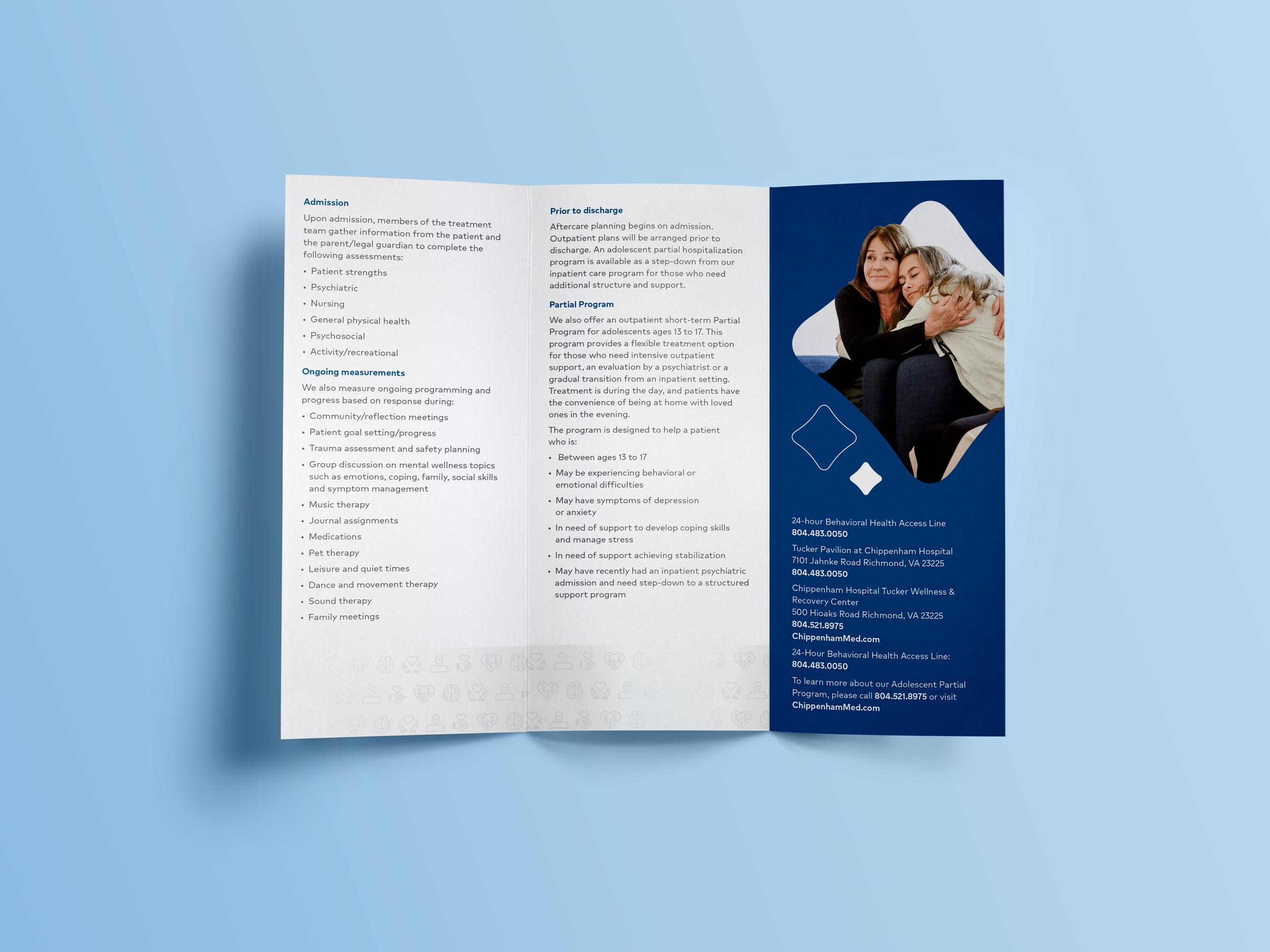
Child and Adolescent Services Brochure
This brochure provides helpful information to patients and parents on mental health services for children and adolescents. For this piece, the primary blues in HCA’s color palette give a calm, inviting feel. Throughout the piece, I implemented the diamond shape from the HCA Healthcare logo for a more branded look. The diamond shape around the photos and the icon usage creatively push the brand further. The imagery chosen effectively reflects the audience and the HCA brand.


NICU Booklet
This brief overview of a saddle stitch booklet designed for new parents utilizes HCA Healthcare’s primary orange and navy colors to bring a warm energy to the book. HCA Healthcare’s icon style is used throughout the booklet for a celebratory feel and visual interest.


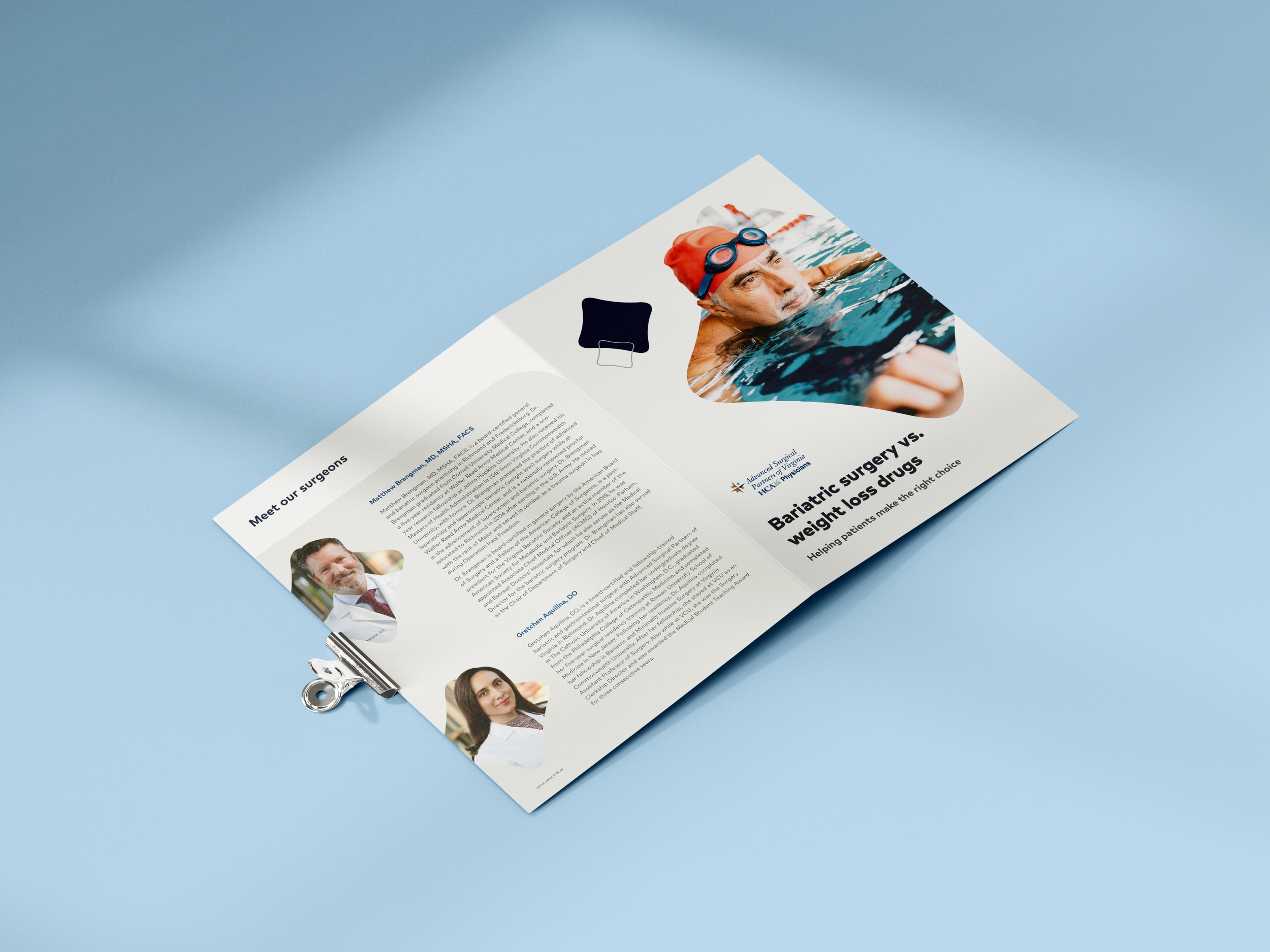
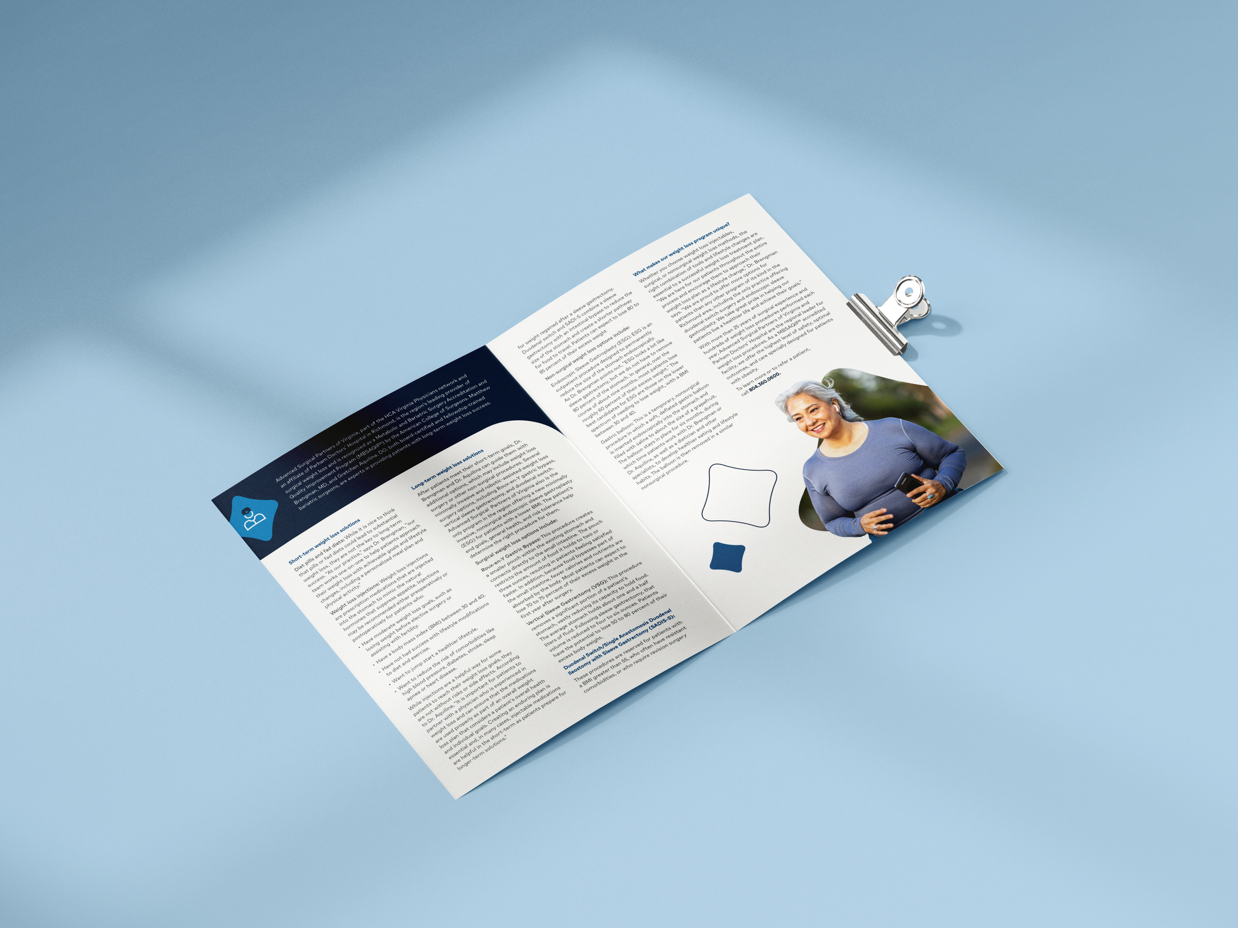
Bariatric Bifold
This bifold provides patients with information and solutions for weight loss surgery. The back of the bifold introduces the bariatric surgeons and the services they provide. This piece leans more on the primary blues in HCA’s color palette while creatively implementing the branded diamond shape in the imagery throughout the piece. I wanted the lifestyle images to feel bright and energetic to reflect the HCA brand.


